How to Build an Interactive Dashboard in Excel
An Excel dashboard displays key metrics and data visualizations on a single sheet that updates…
An Excel dashboard displays key metrics and data visualizations on a single sheet that updates automatically when your data changes. The core building blocks are pivot tables for summarizing data, pivot charts for visualizing it, and slicers for interactive filtering. If you are new to Excel, start with our Excel tutorial for beginners before building dashboards.
Key Takeaways
- Excel dashboards combine pivot tables, pivot charts, and slicers on a single worksheet to create interactive, auto-updating data visualizations.
- Each chart in your dashboard needs its own pivot table — connect all slicers to every pivot table using Report Connections so filtering works across the entire dashboard.
- Format your data as an Excel Table (Ctrl+T) before creating pivot tables to ensure new data rows are automatically included.
How Do I Prepare My Data for an Excel Dashboard?
Organize your raw data into a structured Excel Table with clear column headers, no blank rows, and consistent formatting — this is the foundation that pivot tables and charts rely on.
Step 1: Structure Your Data
Your data should follow these rules:
| Rule | Example |
|---|---|
| One row per record | Each row = one transaction, event, or entry |
| Column headers in row 1 | Date, Product, Region, Sales, Quantity |
| No blank rows or columns | Remove gaps in the data range |
| Consistent data types | Dates as dates, numbers as numbers, text as text |
| No merged cells | Merged cells break pivot tables |
Step 2: Convert to an Excel Table
- Click anywhere in your data range.
- Press Ctrl+T (or go to Insert > Table).
- Confirm the range and check My table has headers.
- Click OK.
Excel Tables automatically expand when you add new rows, so your pivot tables and dashboard stay current without manual updates. For more on Excel Tables and formulas, see our Excel VLOOKUP tutorial.
How Do I Create Pivot Tables for a Dashboard?
Create one pivot table for each chart you plan to display — all pivot tables should reference the same data source so slicers can filter them simultaneously.
Create Your First Pivot Table
- Click anywhere in your Excel Table.
- Go to Insert > PivotTable.
- Select New Worksheet (you will move charts to the dashboard sheet later).
- Click OK.
- Drag fields to the pivot table areas:
- Rows: The category you want to compare (e.g., Product, Region)
- Values: The metric to measure (e.g., Sum of Sales, Count of Orders)
- Columns: Optional secondary breakdown (e.g., Quarter, Month)
Create Additional Pivot Tables
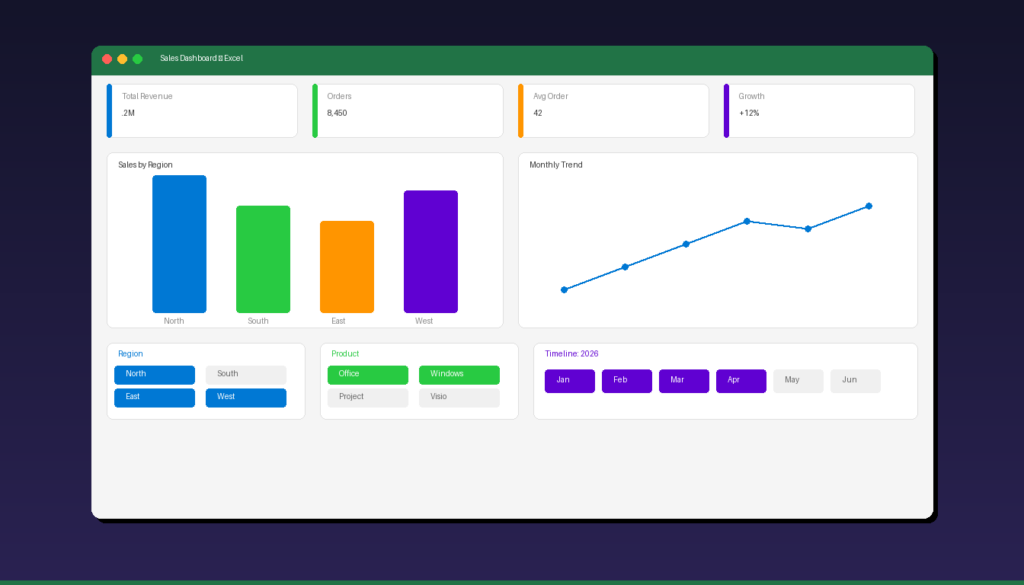
For a typical dashboard with 4-6 charts, create separate pivot tables:
| Pivot Table | Rows | Values | Chart Type |
|---|---|---|---|
| Sales by Region | Region | Sum of Sales | Bar chart |
| Monthly Trend | Month | Sum of Sales | Line chart |
| Product Mix | Product | Sum of Sales | Pie/Donut chart |
| Top Customers | Customer | Sum of Sales | Horizontal bar |
| Quarterly Comparison | Quarter | Sum of Sales, Count | Combo chart |
Each pivot table can be on its own worksheet — you will create charts from them and move the charts to a dedicated dashboard sheet.
How Do I Create Pivot Charts for the Dashboard?
Click inside each pivot table, go to PivotTable Analyze > PivotChart, select the chart type, and move the chart to your dashboard worksheet.
Create a Pivot Chart
- Click inside a pivot table.
- Go to the PivotTable Analyze tab > PivotChart (in the Tools group).
- Select a chart type:
- Bar/Column: Comparing categories (regions, products)
- Line: Showing trends over time
- Pie/Donut: Showing proportions
- Combo: Mixing chart types (bars + line)
- Click OK.
Move Charts to the Dashboard Sheet
- Create a new worksheet and rename it Dashboard.
- Right-click each chart > Move Chart.
- Select Object in > Dashboard.
- Click OK.
- Resize and position the chart on the dashboard sheet.
Chart Formatting Tips
| Setting | Recommendation |
|---|---|
| Chart title | Short, descriptive (e.g., “Sales by Region”) |
| Legend | Show only if chart has multiple series |
| Gridlines | Remove or lighten for cleaner look |
| Colors | Use a consistent 3-5 color palette |
| Data labels | Add for key values, remove for cluttered charts |
| Border | Remove chart border for seamless dashboard look |
How Do I Add Slicers to Make the Dashboard Interactive?
Insert slicers from any pivot table, then connect them to all other pivot tables using Report Connections — clicking a slicer button filters every chart on the dashboard simultaneously.
Insert a Slicer
- Click inside any pivot table.
- Go to PivotTable Analyze > Insert Slicer.
- Check the fields you want as filter buttons (e.g., Region, Product Category, Year).
- Click OK.
- Move each slicer to the Dashboard sheet.
Connect Slicers to All Pivot Tables
This is the critical step most tutorials skip — without Report Connections, slicers only filter one pivot table:
- Click on the slicer.
- Go to the Slicer tab in the ribbon.
- Click Report Connections.
- Check all pivot tables in the list.
- Click OK.
Now when you click a slicer button (e.g., “North” in the Region slicer), every chart on the dashboard filters to show only North region data.
Add a Timeline for Date Filtering
Timelines are specialized slicers for date fields:
- Click inside a pivot table that has a date field.
- Go to PivotTable Analyze > Insert Timeline.
- Select your date field and click OK.
- Move the timeline to the Dashboard sheet.
- Connect it to all pivot tables via Report Connections (same as slicers).
Timelines let users filter by months, quarters, or years with a visual slider — more intuitive than a regular date slicer.
How Do I Format the Dashboard for a Professional Look?
Hide gridlines, remove row/column headers, set a neutral background color, and align all charts to a grid — these formatting touches make the dashboard look polished and presentation-ready.
Clean Up the Dashboard Sheet
- Go to View tab > uncheck Gridlines and Headings.
- Right-click the sheet tab > Tab Color > choose a brand color.
- Select all cells > set Fill Color to a light neutral (white, light gray, or dark for a modern look).
Layout Best Practices
| Element | Position | Size |
|---|---|---|
| Title/Header | Top row, spanning full width | 1 row height |
| KPI cards | Below header, horizontal row | 4-6 cards across |
| Primary chart | Left side, large | 50-60% of width |
| Secondary charts | Right side, stacked | 40-50% of width |
| Slicers | Left sidebar or top bar | Compact, consistent width |
| Timeline | Bottom or top | Full width |
Add KPI Summary Cards
Above your charts, create simple KPI boxes:
- Select a cell and enter a formula that references your pivot table (e.g.,
=GETPIVOTDATA("Sales",PivotTable1)). - Format the cell with large font, bold, and a colored background.
- Add a label cell above or below (e.g., “Total Sales”).
- Group 4-6 KPI cards in a horizontal row across the top.
Common KPIs: Total Revenue, Total Orders, Average Order Value, Top Product, Growth % vs Previous Period.
What Are Common Mistakes When Building Excel Dashboards?
The biggest mistakes are using regular charts instead of pivot charts, not connecting slicers to all pivot tables, and overcrowding the dashboard with too many visualizations.
| Mistake | Impact | Fix |
|---|---|---|
| Regular charts instead of pivot charts | No slicer integration | Recreate as pivot charts |
| Slicers not connected | Filtering only affects one chart | Use Report Connections |
| Too many charts | Overwhelming, hard to read | Limit to 4-6 charts max |
| Inconsistent colors | Unprofessional appearance | Use 3-5 color palette |
| No data validation | Blank or error values in charts | Clean data before building |
| Merged cells in data | Pivot table errors | Never merge data cells |
| Static data range | Dashboard misses new data | Use Excel Tables (Ctrl+T) |
For more Excel data analysis techniques, see our Excel pivot table tutorial and Excel charts and graphs tutorial. If you need Excel with full pivot table and dashboard capabilities, Microsoft Office 2024 Professional Plus ($199.99) includes the complete Excel desktop application.
Frequently Asked Questions
Can I build a dashboard in Excel without pivot tables?
Yes, but it is much harder to maintain. You can use regular charts with SUMIFS, COUNTIFS, and data validation dropdowns for filtering. However, pivot tables automatically summarize data and integrate with slicers, making dashboards significantly easier to build and update. Pivot tables are the recommended approach for any dashboard with more than 2-3 charts.
How many charts should an Excel dashboard have?
Keep dashboards to 4-6 charts maximum. Each chart should answer a specific business question (e.g., “Which region has the highest sales?” or “What is the monthly trend?”). Too many charts make the dashboard hard to read and reduce the impact of each visualization. Use KPI summary cards for simple numbers instead of charts.
Do Excel dashboards update automatically?
Yes, if you use pivot tables connected to an Excel Table data source. When you add new data rows to the table, right-click any pivot table and select “Refresh All” (or press Ctrl+Alt+F5). You can also set pivot tables to refresh automatically when the workbook opens: PivotTable Options > Data > check “Refresh data when opening the file.”
Can I share an Excel dashboard with people who do not have Excel?
Yes. Export the dashboard to PDF (File > Export > Create PDF) for a static snapshot. For interactive sharing, upload the workbook to OneDrive or SharePoint and share a link — recipients can interact with slicers in Excel for the web without installing Excel. Microsoft 365 subscribers can also publish dashboards to Power BI for broader sharing.
by Editorial Team
Updated on April 5, 2026
by Editorial Team
Updated on April 5, 2026
ON THIS PAGE