PivotTables are one of the most powerful features in Microsoft Excel — yet most users never touch them. If you’ve been manually sorting through hundreds of rows to find totals and trends, a PivotTable can do the same work in seconds. This guide picks up right where our Excel tutorial for beginners left off, walking you through everything from creating your first PivotTable to building pivot charts and handling calculated fields.
Whether you’re analyzing sales data, tracking expenses, or summarizing survey results, this excel pivot table tutorial covers every step you need.
Key Takeaways
- A PivotTable lets you summarize thousands of rows into a compact, interactive report without writing formulas.
- Building one takes under 60 seconds: select your data, click Insert → PivotTable, then drag fields into place.
- You can change summary calculations, add filters, create pivot charts, and refresh data — all from the same pane.
What Is a Pivot Table and What Is It Used For?
A PivotTable is an interactive summary tool in Microsoft Excel that reorganizes and aggregates raw data into a structured report — no formulas required.
It lets you answer questions like “Which product sold the most in Q3?” or “What’s the average order value by region?” by dragging and dropping fields rather than writing SUMIF or VLOOKUP chains. PivotTables are used by analysts, accountants, marketers, and project managers who need fast summaries from large datasets — typically anything over 50 rows where manual scanning becomes impractical.
According to Microsoft’s official PivotTable documentation, PivotTables are designed specifically for “analyzing large amounts of data in many user-friendly ways.”
Common use cases: – Monthly sales summaries by product, region, or salesperson – Budget vs. actual expense tracking – Survey response frequency counts – Website traffic breakdowns by channel and date
How Do I Create a Pivot Table in Excel?
To create a PivotTable in Microsoft Excel, select your data range, go to Insert → PivotTable, choose a location, and drag fields into the Rows, Columns, Values, and Filters areas.
Here are the full steps:
-
Organize your source data. Each column must have a header (e.g., Date, Product, Region, Sales). Remove any blank rows or merged cells — Microsoft Excel requires a clean, rectangular dataset.
-
Select the data range. Click any cell inside your dataset, then press Ctrl+Shift+End to extend the selection to the last used cell. You can also manually select the range including headers.
-
Open the PivotTable dialog. Go to the Insert tab → click PivotTable (top-left of the ribbon). In Excel 2021 and Excel 2024, this opens the “Create PivotTable” dialog.
-
Confirm the data range. Excel auto-detects your range. Verify it covers all your data, including headers.
-
Choose a location. Select New Worksheet (recommended) to place the PivotTable on a separate sheet, or Existing Worksheet and specify a cell. Click OK.
-
The PivotTable Fields pane appears on the right side. It lists every column header from your source data as a field you can place into four areas:
- Rows — categories that appear down the left side (e.g., Product Name)
- Columns — categories that spread across the top (e.g., Month)
- Values — the numbers being summarized (e.g., Sales Amount)
-
Filters — a dropdown filter applied to the whole report (e.g., Region)
-
Drag fields into place. For a basic sales summary, drag “Product” to Rows and “Sales Amount” to Values. Microsoft Excel immediately displays a summary table.
-
Your PivotTable is ready. Excel defaults to SUM for numeric fields and COUNT for text fields.
Tip: If you don’t see the PivotTable Fields pane, click anywhere inside the PivotTable to activate it.
How Do I Summarize Data with a Pivot Table?
By default, Microsoft Excel uses SUM for numeric values and COUNT for text. To change the calculation, click the dropdown arrow on the field in the Values area and select Value Field Settings.
Changing the Summary Function
- In the Values area of the PivotTable Fields pane, click the dropdown on your value field (e.g., “Sum of Sales”).
- Select Value Field Settings.
- Under Summarize Values By, choose from:
- Sum — total of all values
- Count — number of entries
- Average — mean value
- Max / Min — highest or lowest value
- Product — multiplied result
- Click OK. The PivotTable updates instantly.
Showing Values As Percentages
In the Value Field Settings dialog, click the Show Values As tab. Options include: – % of Grand Total — each cell as a percentage of the overall total – % of Column Total / % of Row Total – Running Total — cumulative sum down a column – Difference From — change versus a baseline (useful for year-over-year comparisons)
Adding Calculated Fields
When you need a formula-based metric (e.g., Profit Margin = Revenue − Cost), use a calculated field instead of adding a new column to your source data:
- Click anywhere in the PivotTable.
- Go to PivotTable Analyze tab → Fields, Items & Sets → Calculated Field.
- Enter a name (e.g., “Profit”) and a formula using field names in square brackets:
=[Revenue]-[Cost]. - Click Add → OK.
The calculated field appears as a new item in the Values area and updates automatically when data is refreshed.
How to Sort, Filter, and Group Data in a Pivot Table
Microsoft Excel gives you several ways to control which data appears and how it’s ordered.
Sorting
- Click any value in a Row or Column label, then use the Sort A→Z or Sort Z→A buttons on the Data tab.
- To sort by values (e.g., highest sales first), right-click a value cell → Sort → Sort Largest to Smallest.
Filtering
- Row/Column label filters: Click the dropdown arrow next to a row or column header. Check or uncheck items, or use Label Filters and Value Filters for rule-based filtering (e.g., Sales > 10,000).
- Slicers: Go to PivotTable Analyze → Insert Slicer. Select a field (e.g., Region). A visual button panel appears — click any button to filter the PivotTable instantly. Slicers are especially useful in dashboards because they display which filter is active.
- Timeline: For date fields, use Insert Timeline (same tab) to create a visual date-range filter with month/quarter/year granularity.
Grouping
Grouping lets you consolidate date or numeric data into buckets:
- Right-click any date value in your PivotTable → Group.
- Select grouping increments: Days, Months, Quarters, Years (you can select multiple).
- Click OK. Excel collapses individual dates into the selected periods.
For numeric fields (e.g., age ranges or price tiers), right-click a number → Group → set Starting at, Ending at, and By interval.
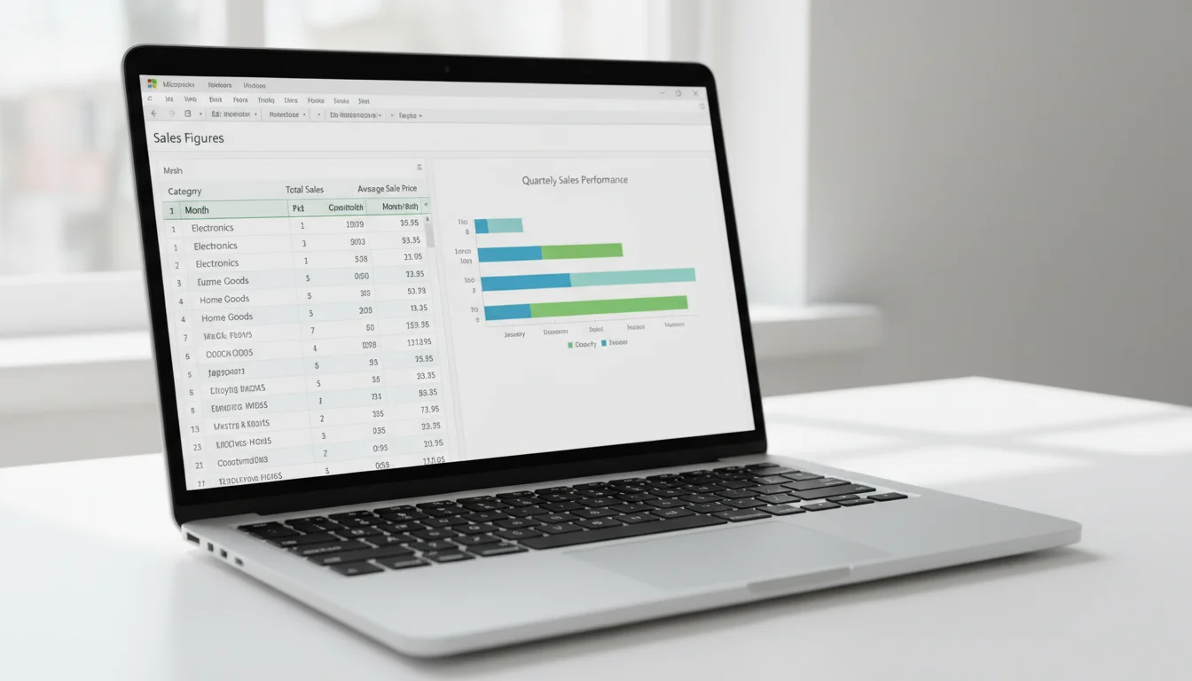
Can I Create a Pivot Chart from a Pivot Table?
Yes. A pivot chart is a dynamic chart linked directly to a PivotTable — when the PivotTable filters change, the chart updates automatically.
To create a pivot chart from an existing PivotTable:
- Click anywhere inside the PivotTable.
- Go to the PivotTable Analyze tab → click PivotChart.
- Select a chart type (Bar, Column, Line, Pie, etc.) → click OK.
The chart appears on the same worksheet and shares the PivotTable’s filters. Any slicer or filter applied to the PivotTable also updates the chart.
To create a pivot chart from scratch (without a PivotTable first):
- Select your data range.
- Go to Insert → PivotChart → PivotChart & PivotTable.
- Configure as normal — Excel creates both simultaneously.
Formatting tips: – Right-click the chart → Change Chart Type to switch visualization at any time. – Use the + button beside the chart to add titles, data labels, and legends. – Pivot charts retain dynamic field buttons in the chart area. To hide them for a cleaner presentation, right-click → Hide All Field Buttons on Chart.
How Do I Refresh a Pivot Table When Data Changes?
A PivotTable does not update automatically when source data changes. You must refresh it manually, or configure automatic refresh on file open.
Manual refresh (fastest): – Right-click anywhere inside the PivotTable → Refresh. – Or: go to Data tab → Refresh All (refreshes all PivotTables and data connections in the workbook).
Keyboard shortcut: Click inside the PivotTable, then press Alt+F5 to refresh that table, or Ctrl+Alt+F5 to refresh all.
Automatic refresh on file open: 1. Click inside the PivotTable. 2. Go to PivotTable Analyze → PivotTable (far left) → Options. 3. Click the Data tab in the dialog. 4. Check Refresh data when opening the file → click OK.
Important: If you add new rows below the original data range, a standard PivotTable will not include them even after refresh — it only reads the range defined when the PivotTable was created. To fix this permanently, convert your source data to an Excel Table first (Insert → Table, or Ctrl+T). An Excel Table expands automatically, so the PivotTable always captures new rows on refresh.
What Is the Difference Between a Pivot Table and a Regular Table?
A regular Excel table organizes raw data in rows and columns. A PivotTable is a separate summary view that aggregates and rearranges that data dynamically — it doesn’t modify the source.
| Feature | Regular Table | PivotTable |
|---|---|---|
| Purpose | Store and display raw data | Summarize and analyze data |
| Data modification | You edit cells directly | Source data is never changed |
| Formulas required | Yes, for aggregation (SUMIF, etc.) | No — drag-and-drop |
| Sorting/filtering | Static column filters | Dynamic, interactive |
| Layout flexibility | Fixed column structure | Rows and columns are fully reconfigurable |
| Automatic totals | Manual or via formula | Built-in subtotals and grand totals |
| Update on new data | Immediately visible | Requires manual refresh (or auto-refresh) |
| Charts | Standard charts (static) | Pivot charts (dynamic, filter-linked) |
The practical rule: use a regular table to store and enter data; use a PivotTable to report on it.
Common Pivot Table Mistakes and How to Avoid Them
Even experienced Excel users run into the same PivotTable pitfalls. Here’s a quick reference for the most common errors:
| Mistake | Why It Happens | Fix |
|---|---|---|
| Blank rows in source data | Excel stops reading at the first blank row | Remove all blank rows; use an Excel Table as the source |
| Missing column headers | PivotTable won’t accept data without headers | Ensure every column has a unique, non-blank header in Row 1 |
| Numbers stored as text | SUM returns 0 or COUNT appears instead | Select the column, Data → Text to Columns → Finish to force numeric conversion |
| PivotTable not including new rows | Source range was fixed at creation | Convert source to Excel Table (Ctrl+T) before creating the PivotTable |
| Grouped dates won’t group | Dates column contains text-formatted dates | Convert to real date values: select column, Data → Text to Columns |
| Calculated field giving wrong result | Formula references the wrong field name | In Calculated Field dialog, double-click field names from the list rather than typing manually |
| Duplicate items in row labels | Extra spaces in source data cells | Use TRIM() on source data to clean whitespace before building the PivotTable |
| Slow PivotTable on large datasets | PivotTable cache is large | Uncheck “Save source data with file” in PivotTable Options → Data tab to reduce file size |
Frequently Asked Questions
Can I use pivot tables in Excel Online?
Yes, Microsoft Excel for the web supports PivotTables with core functionality — create, filter, sort, and refresh. Some advanced features like calculated fields and slicers may have limited support depending on your Microsoft 365 plan.
How many pivot tables can I have in one workbook?
There is no hard limit set by Microsoft Excel on the number of PivotTables per workbook. In practice, performance degrades with many large PivotTables sharing the same cache. Each PivotTable based on the same source range shares one cache by default, which keeps file sizes manageable.
Can I undo changes in a pivot table?
Yes — press Ctrl+Z to undo most PivotTable actions including layout changes, filter selections, and grouping. However, once a PivotTable is refreshed, the undo history for pre-refresh states is cleared.
Do pivot tables update automatically?
No. By default, PivotTables require a manual refresh after source data changes. You can enable automatic refresh on file open via PivotTable Options → Data → Refresh data when opening the file , but real-time automatic refresh during editing is not available without VBA macros or Power Query connections.
If you’re working with Microsoft Excel regularly, having a genuine licensed copy ensures you get all PivotTable features — including pivot charts, slicers, and calculated fields — without limitations. Office 2024 Professional Plus ($199.99) includes the full Microsoft Excel 2024 feature set, while Office 2021 Professional Plus ($64.99) covers all the PivotTable functionality covered in this tutorial. Check our Office 2024 lifetime license guide for a full feature comparison, or browse affordable Microsoft Office keys if you’re watching your budget.