Regression analysis in Excel identifies the relationship between variables — predicting how changes in one variable (like advertising spend) affect another (like sales revenue). Excel offers three methods: scatter chart trendlines for quick visualization, the Data Analysis ToolPak for comprehensive statistics, and the LINEST function for formula-based analysis. For prerequisite skills, see our intermediate Excel tutorial.
Key Takeaways
- The fastest method is a scatter chart with a trendline — right-click any data point, select Add Trendline > Linear, and check “Display Equation” and “Display R-squared.”
- The Data Analysis ToolPak (Data tab > Data Analysis > Regression) provides comprehensive output including R², adjusted R², coefficients, standard errors, p-values, and F-statistic.
- The LINEST function (
=LINEST(y_range, x_range, TRUE, TRUE)) returns regression statistics as an array formula without needing the ToolPak add-in.
How Do I Set Up Data for Regression Analysis?
Organize your data with the independent variable (X) in one column and the dependent variable (Y) in another — ensure there are no blank cells, text values, or outliers in the data range.
Data Structure
| Column | Role | Example |
|---|---|---|
| X (Independent) | The variable you control or observe | Ad Spend, Temperature, Hours Studied |
| Y (Dependent) | The variable you want to predict | Sales Revenue, Ice Cream Sales, Test Score |
Example Dataset
| Month | Ad Spend ($) | Sales Revenue ($) |
|---|---|---|
| Jan | 5,000 | 42,000 |
| Feb | 7,000 | 48,000 |
| Mar | 8,000 | 55,000 |
| Apr | 10,000 | 61,000 |
| May | 12,000 | 70,000 |
| Jun | 15,000 | 78,000 |
Data Preparation Checklist
- No blank rows or cells in the data range
- Numbers formatted as numbers (not text)
- Remove obvious outliers or data entry errors
- At least 20-30 data points for reliable results (more is better)
- X and Y columns should be adjacent for easier selection
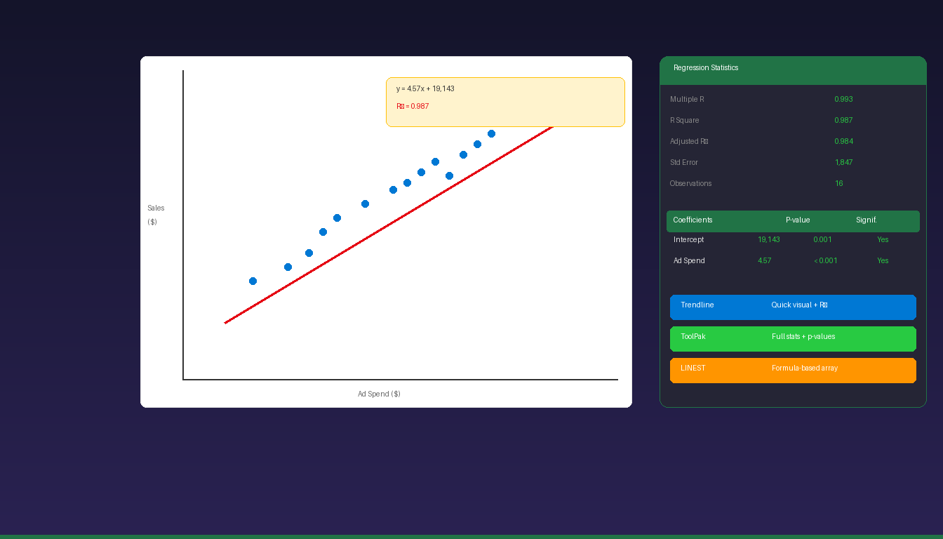
How Do I Create a Regression Trendline on a Scatter Chart?
Create a scatter chart from your data, right-click a data point, select Add Trendline > Linear, and check both “Display Equation on chart” and “Display R-squared value.”
Step-by-Step
- Select your X and Y data (including headers).
- Go to Insert > Chart > Scatter (X Y Scatter).
- Click Scatter with only Markers (first option).
- Right-click any data point on the chart.
- Select Add Trendline.
- Choose Linear (or Polynomial, Exponential, etc.).
- Check Display Equation on chart.
- Check Display R-squared value on chart.
- Click Close.
Reading the Results
The chart displays two values:
- Equation:
y = 4.57x + 19,143— for every $1 increase in Ad Spend, Sales increase by $4.57 - R² = 0.987 — 98.7% of the variation in Sales is explained by Ad Spend
| R² Value | Interpretation |
|---|---|
| 0.90 – 1.00 | Very strong relationship |
| 0.70 – 0.89 | Strong relationship |
| 0.50 – 0.69 | Moderate relationship |
| 0.30 – 0.49 | Weak relationship |
| 0.00 – 0.29 | Very weak or no relationship |
The trendline method is best for quick visual analysis and presentations. For detailed statistics (p-values, standard errors), use the Data Analysis ToolPak.
How Do I Use the Data Analysis ToolPak for Regression?
Enable the Analysis ToolPak add-in, go to Data > Data Analysis > Regression, select your X and Y ranges, and Excel generates a comprehensive regression output table.
Enable the ToolPak
- Click File > Options > Add-ins.
- Select Excel Add-ins in the Manage dropdown > click Go.
- Check Analysis ToolPak > click OK.
- Data Analysis now appears in the Data tab.
Run the Regression
- Click Data > Data Analysis.
- Select Regression > click OK.
- Input Y Range: Select the Y (dependent) column including header.
- Input X Range: Select the X (independent) column(s) including header.
- Check Labels (if you included headers).
- Choose Output Range (select a blank area) or New Worksheet.
- Optionally check Residuals and Residual Plots for diagnostics.
- Click OK.
Understanding the Output
Excel generates three output sections:
Regression Statistics:
| Statistic | What It Means |
|---|---|
| Multiple R | Correlation coefficient (0 to 1) |
| R Square | Proportion of variance explained |
| Adjusted R Square | R² adjusted for number of predictors |
| Standard Error | Average prediction error |
| Observations | Number of data points |
ANOVA Table:
| Field | What It Means |
|---|---|
| F | Overall model significance (higher = better) |
| Significance F | p-value for the model (< 0.05 = statistically significant) |
Coefficients Table:
| Field | What It Means |
|---|---|
| Intercept | Y value when X = 0 |
| X Coefficient | Change in Y for each unit increase in X |
| Standard Error | Precision of the coefficient estimate |
| t Stat | Coefficient divided by standard error |
| P-value | Probability the coefficient is zero (< 0.05 = significant) |
| Lower/Upper 95% | Confidence interval for the coefficient |
How Do I Use the LINEST Function for Regression?
Enter =LINEST(y_range, x_range, TRUE, TRUE) as an array formula — it returns the slope, intercept, and regression statistics without needing the Data Analysis ToolPak.
Basic LINEST
=LINEST(B2:B7, A2:A7, TRUE, TRUE)
Select a 5-row by 2-column range, enter the formula, and press Ctrl+Shift+Enter (or just Enter in Microsoft 365 with dynamic arrays).
LINEST Output Layout
| Row | Column 1 (Slope) | Column 2 (Intercept) |
|---|---|---|
| 1 | Slope (m) | Intercept (b) |
| 2 | Standard error of slope | Standard error of intercept |
| 3 | R² | Standard error of Y estimate |
| 4 | F statistic | Degrees of freedom |
| 5 | Regression SS | Residual SS |
When to Use LINEST vs ToolPak
| Feature | LINEST | Data Analysis ToolPak |
|---|---|---|
| Output type | In-cell array | Separate output table |
| Auto-updates | Yes (formula) | No (static, must re-run) |
| Multiple regression | Yes (multiple X columns) | Yes |
| Residual plots | No | Yes |
| p-values | No (must calculate) | Yes (included) |
| Best for | Dynamic models, dashboards | One-time detailed analysis |
How Do I Run Multiple Regression in Excel?
Multiple regression uses two or more independent variables — select multiple X columns in the Data Analysis ToolPak or include multiple columns in the LINEST x_range argument.
ToolPak Method
- Click Data > Data Analysis > Regression.
- Input Y Range: Select the Y column.
- Input X Range: Select all X columns together (e.g., A2:C7 for 3 predictors).
- Check Labels and click OK.
LINEST Method
=LINEST(D2:D50, A2:C50, TRUE, TRUE)
Select a 5-row by 4-column range (one extra column for the intercept) and press Ctrl+Shift+Enter.
Example: Sales Predicted by Ad Spend + Store Count + Season
The coefficients table shows each variable’s independent contribution to predicting Sales, controlling for the other variables. Check p-values — only variables with p < 0.05 are statistically significant predictors.
What Are Common Regression Mistakes in Excel?
The biggest mistakes are using too few data points, ignoring non-linear relationships, and assuming correlation equals causation.
| Mistake | Impact | Fix |
|---|---|---|
| Too few data points | Unreliable R² and coefficients | Use 30+ observations minimum |
| Non-linear data with linear trendline | Poor fit, misleading R² | Try polynomial or logarithmic trendline |
| Correlation ≠ causation | Wrong conclusions | Regression shows association, not cause |
| Including outliers | Skews coefficients and R² | Remove or investigate outliers |
| Multicollinearity | Unstable multiple regression | Check if X variables are correlated |
| Ignoring p-values | Using non-significant predictors | Only trust coefficients with p < 0.05 |
| Extrapolating beyond data | Predictions outside data range are unreliable | Only predict within the X range |
For more Excel data analysis, see our Excel Solver tutorial and Excel pivot table tutorial. For Python-based regression in Excel, see our Python in Excel tutorial. If you need Excel with the Data Analysis ToolPak, Microsoft Office 2024 Professional Plus ($199.99) includes the full Excel desktop application.
Frequently Asked Questions
What is R² and what is a good value?
R² (R-squared) measures how much of the variation in Y is explained by X. An R² of 0.85 means 85% of the variation is explained. In business contexts, R² above 0.70 is generally considered strong. In scientific research, R² above 0.90 is expected. A low R² does not mean the model is wrong — it may mean other variables not in the model affect Y.
Can I do regression analysis in Excel for free?
Yes. The scatter chart trendline method and LINEST function work in all Excel versions including Excel for the web. The Data Analysis ToolPak is a free add-in included with Excel desktop — you only need to enable it. No paid add-ins or external software are required.
What is the difference between simple and multiple regression?
Simple regression uses one independent variable (X) to predict Y. Multiple regression uses two or more independent variables (X1, X2, X3) to predict Y. Multiple regression provides better predictions when the dependent variable is influenced by several factors. Both are available in Excel through the ToolPak and LINEST.
How do I know if my regression results are statistically significant?
Check two things: (1) The Significance F value in the ANOVA table should be less than 0.05 — this means the overall model is statistically significant. (2) The p-value for each coefficient should be less than 0.05 — this means that specific variable is a significant predictor. If Significance F > 0.05, the model as a whole is not reliable.