A Gantt chart visualizes project tasks as horizontal bars along a timeline, showing start dates, durations, and task overlaps at a glance. Excel does not have a built-in Gantt chart type, but you can create one by customizing a stacked bar chart to display task durations against a date axis. If you are new to Excel charts, start with our Excel charts and graphs tutorial first.
Key Takeaways
- Create a Gantt chart in Excel by inserting a stacked bar chart, hiding the first data series (start dates), and formatting the horizontal axis as a date timeline.
- Your data table needs four columns: Task Name, Start Date, End Date, and Duration (calculated as End Date minus Start Date).
- Free Gantt chart templates are available from Microsoft’s template gallery, Vertex42, and TeamGantt — download and customize them with your project data.
How Do I Set Up Data for a Gantt Chart?
Create a table with Task Name, Start Date, End Date, and Duration columns — the Duration column uses a formula to calculate the number of days between start and end dates.
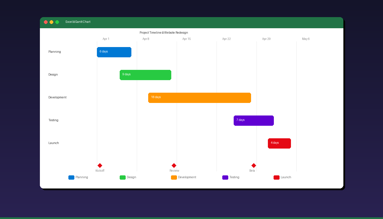
Step 1: Create the Data Table
| Task | Start Date | End Date | Duration |
|---|---|---|---|
| Planning | 2026-04-01 | 2026-04-07 | 6 |
| Design | 2026-04-05 | 2026-04-14 | 9 |
| Development | 2026-04-10 | 2026-04-28 | 18 |
| Testing | 2026-04-25 | 2026-05-02 | 7 |
| Launch | 2026-05-01 | 2026-05-05 | 4 |
Step 2: Add the Duration Formula
In the Duration column (D2), enter: =C2-B2
This calculates the number of days between Start Date and End Date. Copy the formula down for all tasks.
Step 3: Convert Start Dates to Numbers
Excel needs the Start Date column as numbers (not formatted dates) for the stacked bar chart to work correctly:
- Select the Start Date column values (B2:B6).
- Note the values — you will need the earliest date as a number later.
- The earliest start date’s serial number is used to set the chart axis minimum.
To find a date’s serial number: select the cell, go to Home > Number Format > General. The number displayed (e.g., 46113 for April 1, 2026) is the serial number. Switch back to Date format after noting it.
How Do I Create the Stacked Bar Chart?
Select your Task, Start Date, and Duration columns, insert a Stacked Bar chart, then hide the Start Date series to reveal the Gantt bars.
Step 1: Select Data and Insert Chart
- Select the Task column and the Start Date + Duration columns (hold Ctrl to select non-adjacent columns: A1:A6, then Ctrl+click B1:B6, then Ctrl+click D1:D6).
- Go to Insert > Bar Chart > 2-D Bar > Stacked Bar.
- Excel creates a stacked bar chart with two colored series.
Step 2: Hide the Start Date Series
The first series (Start Date) positions the bars — you need to make it invisible:
- Click on the first colored bars (Start Date series).
- Right-click > Format Data Series.
- Under Fill, select No fill.
- Under Border, select No line.
- The Start Date bars become invisible, and only the Duration bars remain — positioned correctly along the timeline.
Step 3: Reverse Task Order
By default, Excel shows tasks bottom-to-top. To display them top-to-bottom like a traditional Gantt chart:
- Click on the vertical axis (task names).
- Right-click > Format Axis.
- Check Categories in reverse order.
- Tasks now display in the correct top-to-bottom order.
How Do I Format the Timeline Axis?
Set the horizontal axis minimum to your project start date, adjust the major units to show weeks or days, and format the date display for readability.
Set Axis Bounds
- Click the horizontal axis (dates/numbers at the top).
- Right-click > Format Axis.
- Under Axis Options > Bounds:
- Minimum: Enter the serial number of your project start date (e.g., 46113 for April 1, 2026)
- Maximum: Enter the serial number of your project end date plus a few days
- Under Units:
- Major: 7 (for weekly gridlines) or 1 (for daily)
- Under Number > Category: select Date and choose a format (e.g., “Apr 1”).
Format Gridlines
- Click any gridline on the chart.
- Right-click > Format Gridlines.
- Set to a light gray color and thin line width for a clean look.
How Do I Add Color-Coding and Labels to the Gantt Chart?
Format individual task bars with different colors to indicate status, priority, or department — add data labels to show duration or task details directly on the bars.
Color-Code by Status
- Click a single bar (click once to select the series, click again to select one bar).
- Right-click > Format Data Point > Fill > choose a color.
| Status | Suggested Color |
|---|---|
| Not Started | Light gray (#D0D0D0) |
| In Progress | Blue (#0078D4) |
| Completed | Green (#28CA42) |
| Delayed | Red (#E50914) |
| On Hold | Orange (#FF9500) |
Add Data Labels
- Click the Duration bars.
- Right-click > Add Data Labels.
- Click a label > right-click > Format Data Labels.
- Check Value to show duration numbers.
- Optionally check Category Name to show task names on the bars.
Add a Chart Title
- Click the chart title placeholder.
- Type your project name (e.g., “Website Redesign — Project Timeline”).
How Do I Add Milestones to the Gantt Chart?
Add milestones as diamond-shaped markers on specific dates — create a separate data series with zero duration and format it as a marker instead of a bar.
Add Milestone Data
Add milestone rows to your data table with Duration = 0:
| Task | Start Date | End Date | Duration |
|---|---|---|---|
| Kickoff Meeting | 2026-04-01 | 2026-04-01 | 0 |
| Design Review | 2026-04-14 | 2026-04-14 | 0 |
| Beta Release | 2026-04-28 | 2026-04-28 | 0 |
Format Milestones
- Update the chart data range to include milestone rows.
- Click a milestone bar (it appears as a thin line since duration = 0).
- Right-click > Change Series Chart Type.
- Change the milestone series to Scatter or XY (Scatter) with markers.
- Format the markers as diamond shapes with a distinctive color.
Alternatively, add milestones as vertical lines using secondary axes — this is more complex but produces cleaner results for presentations.
What Are the Limitations of Gantt Charts in Excel?
Excel Gantt charts are static visualizations that require manual updates — they lack dependency tracking, resource management, and automatic schedule adjustment found in dedicated project management tools.
| Feature | Excel Gantt Chart | Microsoft Project | Online PM Tools |
|---|---|---|---|
| Cost | Included with Excel | $59.99/mo (Plan 3) | $10-30/mo |
| Dependencies | Manual only | Automatic | Automatic |
| Resource management | No | Yes | Varies |
| Auto-scheduling | No | Yes | Yes |
| Collaboration | Share file | Cloud-based | Cloud-based |
| Best for | Simple timelines, 5-20 tasks | Complex projects, 50+ tasks | Team collaboration |
| Learning curve | Low (if you know Excel) | High | Medium |
When to Use Excel for Gantt Charts
- Small projects with 5-20 tasks
- Quick visualizations for meetings and reports
- Budget-conscious teams that already have Excel
- One-time timelines that do not need frequent updates
When to Use Dedicated Tools
- Projects with 50+ tasks and complex dependencies
- Teams needing real-time collaboration and automatic rescheduling
- Resource allocation and workload management requirements
For more Excel visualization techniques, see our Excel dashboard tutorial and Excel pivot table tutorial. If you need Excel for project timelines, Microsoft Office 2024 Professional Plus ($199.99) includes the full Excel desktop application. For enterprise project management, Microsoft Project Professional 2024 ($104.99) offers built-in Gantt charts with dependency tracking.
Frequently Asked Questions
Does Excel have a built-in Gantt chart template?
Yes. Go to File > New and search for “Gantt chart” in the template search bar. Microsoft offers several free Gantt chart templates pre-formatted with task lists, timelines, and color-coding. These templates save setup time compared to building from scratch with a stacked bar chart.
Can I create a Gantt chart in Excel for free?
Yes. Any version of Excel (including Excel for the web) can create a Gantt chart using the stacked bar chart method described in this tutorial. Free templates are also available from Microsoft’s template gallery, Vertex42, and TeamGantt — all compatible with Excel 2016 and later.
How do I update a Gantt chart when project dates change?
Update the Start Date and End Date values in your data table — the Duration formula recalculates automatically, and the chart bars adjust to reflect the new dates. If you add new tasks, right-click the chart > Select Data > expand the data range to include the new rows.
Can I show task dependencies in an Excel Gantt chart?
Not automatically. Excel’s stacked bar chart does not support dependency arrows (finish-to-start, start-to-start). You can manually add arrows using Insert > Shapes, but they do not update when dates change. For automatic dependency tracking, use Microsoft Project or an online project management tool.